I was lucky enough to go to the Chelsea Flower Show on Saturday as I was helping a contractor friend with a few last minute bits and pieces. The buzz of Chelsea build-up is something I wish everybody could experience as there is almost nothing to beat it!
As always, it’s the gardens that draw me first, and I was excited that Christopher Bradley Hole was returning after an eight year break. Christopher’s work always manages to find a new and often challenging viewpoint which doesn’t perhaps happen as often as you might think. Chelsea gardens have to balance two conflicting needs – those of the sponsor for a high prestige medal, and those of the designer who would like to show how creative they can be, given a free reign. Too often, though understandably, the result is to opt for a safe, tried and tested garden that doesn’t take too many potentially medal-reducing risks.
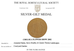
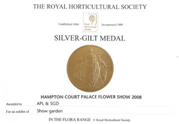
This was true of many of the gardens at Chelsea this year; while often beautifully crafted with stunning plants, the limited influx of new designers – who find it hard to gain sponsorship or coax sponsors away from more experienced designers – means that many of the designs have been seen before. While not necessarily a bad thing for a show which must be a crowd pleaser, it does mean that innovation and real creativity are not usually at the forefront. As a designer with two silver-gilt medals from the RHS (yes, I’d love to win a gold, but would still rather take a few risks with the design!), I would welcome a change in the judging at Chelsea where a higher emphasis is placed on creativity. At present, you are judged on how well you have hit your brief, rather than on how creative your garden is.
It’s a long running debate within the business, and I can understand the RHS’s reluctance to change a formula that works to put on a show that is reliably spectacular (which it most certainly is) but perhaps now the show is 100 they could feel secure enough to allow it to grow into new directions for the next century.
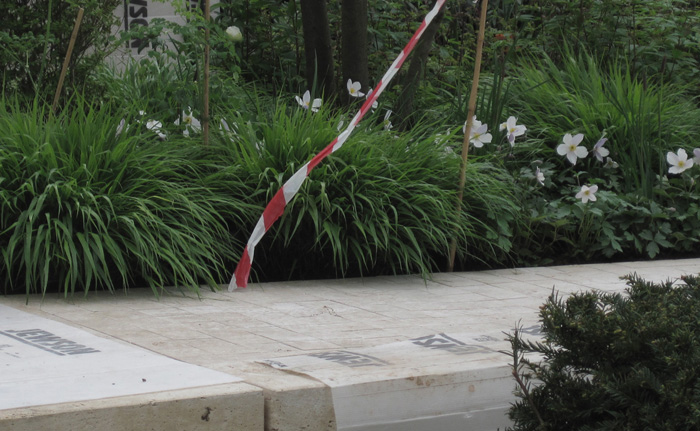
Ulf Nordfjell, a Swedish designer with two gold medals and a best in show to his name, returned for a French-inspired garden complete with fastigiate (that’s tall and thin) oak trees, clipped cuboids of yew and some beautiful Travertine stone detailing (see above – with the paving still protected prior to judging).
But while there were some truly beautiful elements to it, the garden didn’t flow in the way his previous gardens have done; where he has been the master of calm spaces balancing the more exuberant elements, to me that balance was missing this time, and the garden felt cluttered with no specific focus or route. I suppose it’s a little like creating a sequel to a movie, the first is always the best and the more you create, the more diluted that original vision becomes.
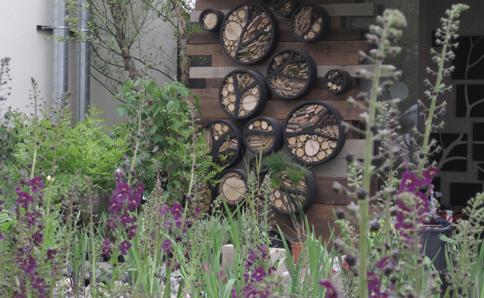
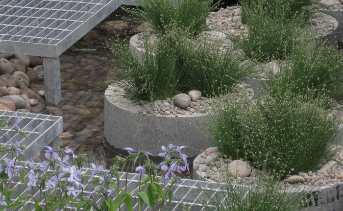
Nigel Dunnett’s wetland roof garden (above) also treads a well-worn theme, but with Nigel, as a plantsman first and designer second, his work improves each year. I have to confess to some bias here, as it was seeing Nigel’s innovative work for a Sheffield roundabout that was published in The Garden sometime in the 1990′s that set me on the path to garden design, and his continual curiosity and research inspire many to a new way of gardening. I thought the water channel (below) with metal grating path and filtration system (the plants in the pipes) was particularly effective, and I liked his limited use of plant material and colour.
However, his designs for Chelsea can suffer from a desire to put too much in (a pitfall for many Show Garden designers) and would benefit from some simplification, but unlike other designers who are hoping for commissions from showing at Chelsea, Nigel’s primary aim is to bring his learning to a wider audience, and this he achieves.
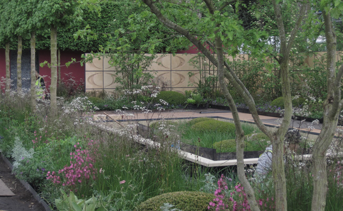
Robert Myers is also a Chelsea veteran, and I thought his garden (above and below) had some interesting elements; he’s also not afraid to take a few risks and so his Chelsea gardens have been different from each other and always have something fresh to offer. This time, he has used solely British native plants, but, with a balance of structure and froth in the planting which has dominated the Chelsea planting style for the last 10 or so years, I’m not sure that the general public will be aware that it is different from anything that has been done before.
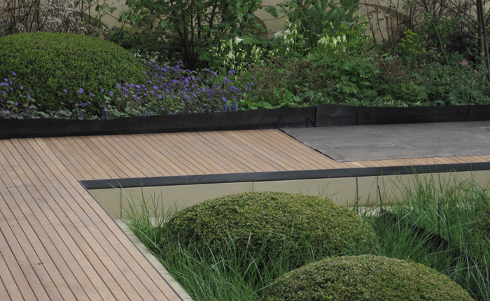
What I particularly liked about this garden, though, was the sunken lawn, surrounded on two sides by water and on the other two by a metal-edged deck (again, with deck and planting edge protected prior to judging). The sunken garden consisted of areas of mown lawn juxtaposed against areas of long grass with clipped box mounds and separated by crisply sawn stone bands. While elements like this have been seen before at Chelsea, the change of levels made this an intriguing space, one where you’d like to sit on the edge of the deck and dangle your feet.
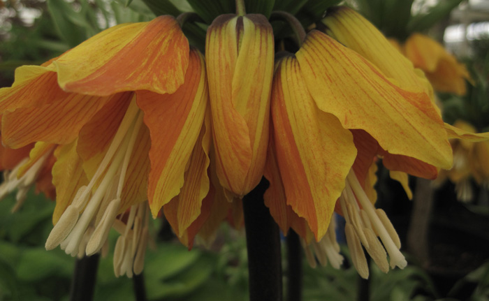
Another of my contractor friends, a giant of a man, says that the flowers in the marquee are his ‘guilty pleasure’… It was hard to believe that we’ve had such a late spring when the marquee was as full as ever of sensory overload (though it was strange to see blossom in several of the gardens) and it’s even harder to pick out just a few highlights. However, I was struck by this Fritillaria imperialis (above) with its huge and stately flowerheads that normally have a solid colour of deep orange or yellow. This form was grown by Jacques Armand and – if a Crown Imperial can ever be subtle – I loved this more gentle version.

Definitely subtle was Norfield Nursery’s collection of acers, beautifully displayed to highlight the variations in colours and textures that this genus offers at any time of year (acers are most definitely ‘not just for autumn’).
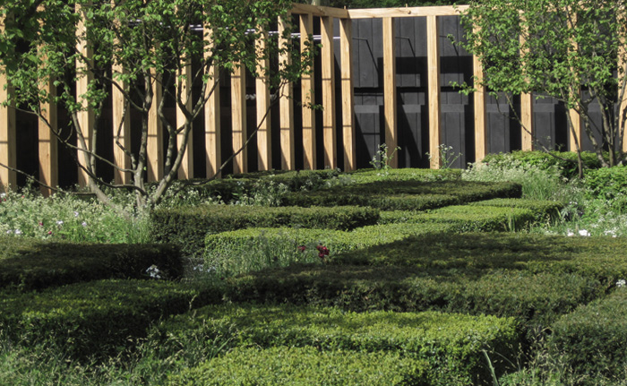
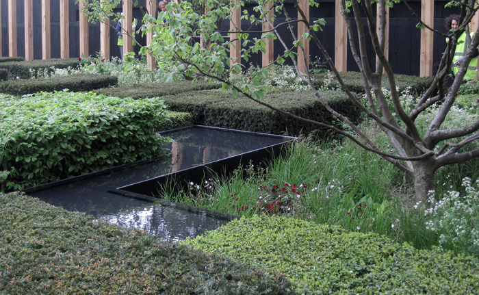
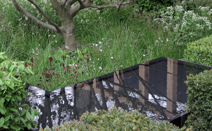
And so, finally, back to Christopher Bradley Hole. As an architect initially, Christopher’s designs are based on classical proportions and his gardens are created from form, not ornament. In essence, this means that the structure supplies the decoration, rather than the converse where a space is ’decorated’ with plants or other features etc (some garden designers can be accused of simply ‘prettifying’ a space rather than creating the space in the first place.) This garden was created from pure form and was designed to be viewed from two narrow arcades which ran the length and width of the garden. Interlocking planes were created from one of three elements – water, tightly clipped plants (beech, box and yew) and stylised meadow, which, while its individual plants were of a hazy form, formed a ‘block’ of froth. This created a tension and dynamism between the various elements, with the planes of water bringing both light and reflections into the scene. It was subtle, clever and mesmerising. Good to have you back, Christopher!
